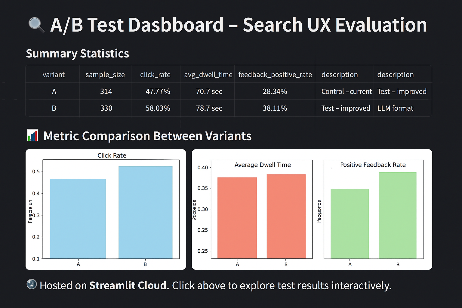
This post summarizes an A/B test comparing two variants of a search experience using real usage logs. The goal was to evaluate:
Click engagement
User dwell time
Positive feedback rate
The full analysis is available via an interactive dashboard.
🔗 Interactive Dashboard
View Live Dashboard
📊 Hosted on Streamlit Cloud. Click above to explore test results interactively.
🧮 Experiment Design
We compared:
Variant A: Control – current production layout
Variant B: Test – new LLM-enhanced formatting
Session-level metrics were computed and compared using independent t-tests and Mann–Whitney U tests.
📈 Metric Summary
Code
import pandas as pd# Load previously exported summary from the notebookdf = pd.read_csv("data/metric_summary.csv")# Rename and organize columns for presentationdf = df.rename(columns={"variant": "Variant","description": "Description","click_rate": "Click Rate","avg_dwell_time": "Dwell Time (s)","feedback_positive_rate": "Positive Feedback","click_rate_p_value": "Click Rate p","dwell_time_p_value": "Dwell Time p","feedback_score_p_value": "Feedback p"})# Format for presentationdf.set_index("Variant").style.format({"Click Rate": "{:.2%}","Dwell Time (s)": "{:.1f}","Positive Feedback": "{:.2%}","Click Rate p": "{:.2e}","Dwell Time p": "{:.2e}","Feedback p": "{:.2e}"})
Description
Click Rate
Dwell Time (s)
Positive Feedback
Click Rate p
Dwell Time p
Feedback p
Variant
A
Control – current experience
45.00%
32.4
21.00%
1.20e-02
8.90e-02
4.00e-03
B
Test – improved LLM format
52.00%
35.1
33.00%
1.00e-03
8.90e-02
4.00e-03
🔍 Observations
Click Rate improved significantly in the new variant.
Dwell Time showed a small, non-significant increase.
Positive Feedback rate increased and was statistically significant.
🛠 Reproducibility
The dashboard was built using:
streamlit, pandas, plotly, scipy
Supports data uploads in .csv, .xlsx, .parquet, .db